Jose Cuervo Rebrand
2021
2021
Brand Identity
Market Research
Package Design
Market Research
Package Design
In recent years the tequila industry has gone through somewhat of a transformation similar to that of whiskey in the early 2000’s. Consumers are now showing favor in brands with refined texture and flavor, willing to spend the extra money to taste the results. By highlighting the brand’s extensive history and experience in the craft of tequila production, Jose Cuervo can reposition themselves as the leading authority of the industry they know themselves to be.
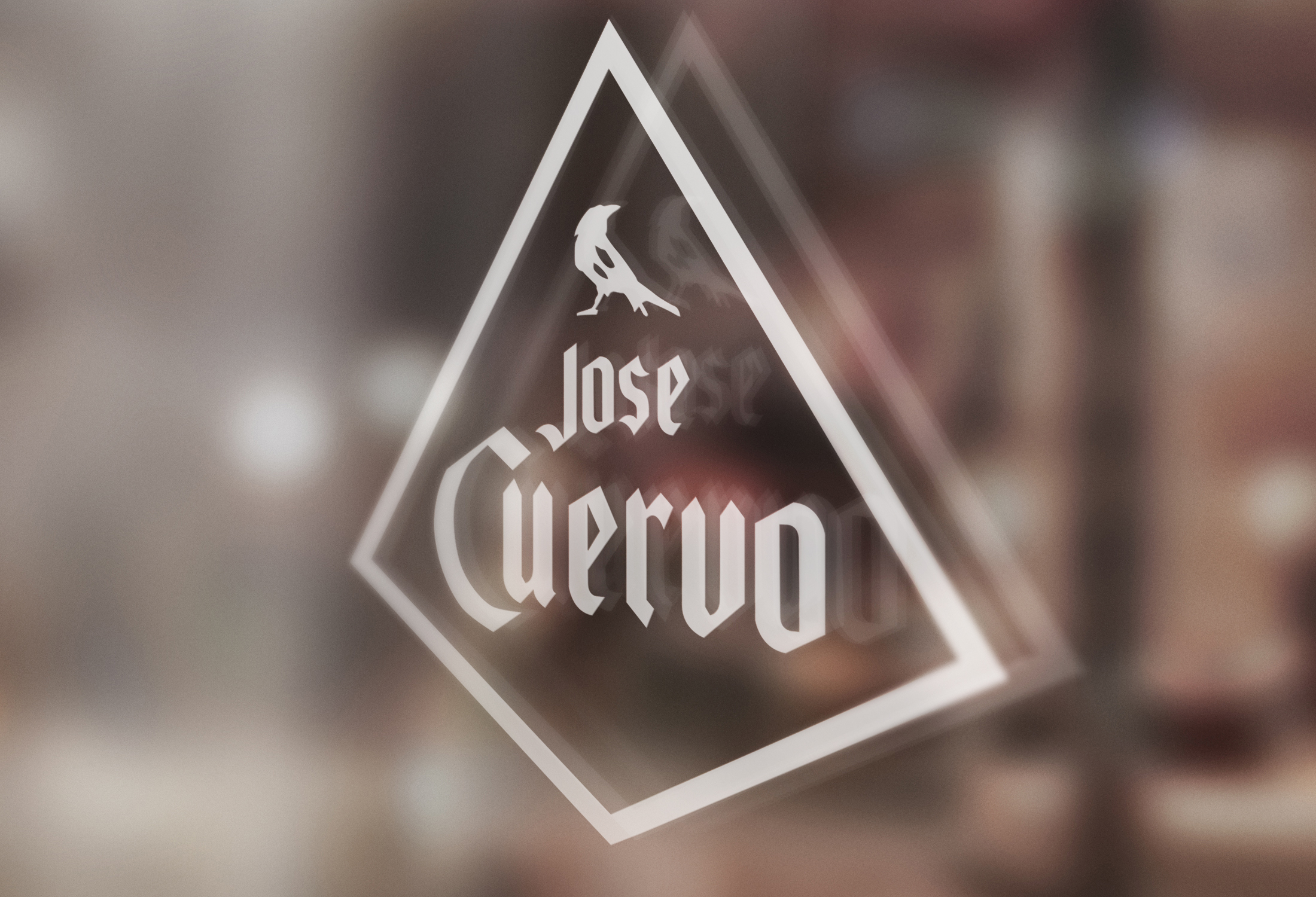
The challenge was in highlighting the history without becoming too dated, two problems the brand was already struggling with. By cleaning up the wordmark it becomes modernized without stripping its recognizability. The addition of the crow calls back to the original Cuervo family crest, and the diamond shape reflects the brand’s historic ties to royalty while also alluding to the sharpness of the tequila. A new color palette and graphic elements bring the history into a modern context, combining old and new into a unified rebrand.
The challenge was in highlighting the history without becoming too dated, two problems the brand was already struggling with. By cleaning up the wordmark it becomes modernized without stripping its recognizability. The addition of the crow calls back to the original Cuervo family crest, and the diamond shape reflects the brand’s historic ties to royalty while also alluding to the sharpness of the tequila. A new color palette and graphic elements bring the history into a modern context, combining old and new into a unified rebrand.